
5 Minute Dad
An app to help expectant fathers prepare for parenthood.
5 minutes at a time.
There is no textbook for fatherhood, but 5 Minute Dad aims to be the next best thing. With pre-populated checklists, curated recommendations, evidence-based sources, and a routine-building core loop to help users through it all, 5 Minute Dad takes the stress out of preparing for parenthood.
Role
UX Designer
Platform
Android
Timeline
8 Weeks
Tools
Figma, Adobe CC
Project
Academic,
Individual
Problem Space
A new era of fatherhood
Context
Millennial Dads Have it Rough
While fatherhood is as ancient as humanity itself, the institution has undergone significant changes in recent years. The role has evolved from a stoic provider, protector, and disciplinarian into an equal caregiver for whom strictly gendered divisions of labour have fallen aside.
Three-quarters of new fathers in Canada are Millennials (now aged 27-42), and they have embraced – and driven – this changing Zeitgeist in parenting philosophy more so than any previous generation of dads.
Millennial dads face a double burden. They are doing 3 times more childcare and housework than past generations, and 9 in 10 feel pressure to be “the perfect dad.”
Struggling to balance this with traditional masculinity and work success takes a toll on their mental health: 1 in 3 dads feels overwhelmed, and they experience anxiety at rates 3-5 times higher than the average man.
Millennial dads are having a rough time.
How can I help them?
User Interviews
How are dads managing the process now?
To gain a more concrete human-centric understanding of the issue, I interviewed 5 Millennial dads with children aged 4 or younger. The age cut-off ensured that they were still able to remember all the details from the pregnancy.
Of the 100s of notes I extracted from the interviews, here are some examples of some key moments that I used to identify emergent themes:

Fear & Uncertainty
Millennial dads often feel anxious and overwhelmed by the many unknowns that come with impending fatherhood.
Understanding the psychology that comes with pregnancy is important to consider when developing a solution to help. While shining a light on those unknowns and providing a clear path forward is likely to be a valuable aspect of the solution, validating dads’ emotional response to pregnancy and respecting the user by entrusting them with difficult truths may have value, too.
Finding Reliable & Values-Aligned Information
Millennial dads want parenting information that is trustworthy, but also want it to align with their core values.
3 of 5 respondents expressed difficulty in finding resources tailored to fathers, and others expressed difficulty determining which information was credible.
Desire to Be a Supportive Partner and Father
Millennial dads often feel anxious and overwhelmed by the many unknowns that come with impending fatherhood.
Understanding the psychology that comes with pregnancy is important to consider when developing a solution to help. While shining a light on those unknowns and providing a clear path forward is likely to be a valuable aspect of the solution, validating dads’ emotional response to pregnancy and respecting the user by entrusting them with difficult truths may have value, too.
Managing Time & Staying Organized ✓
Millennial dads use some ad hoc digital tools to plan for parenthood, but frequently put the burden of planning on their partners.
This theme had many pain points among interviewees, and importantly was the locus for many of the active behaviours expressed. 80% of respondents mentioned adapting some form of digital tool, commonly Google Sheets, for the purposes of staying organized and managing key dates.
This theme represented fertile ground for producing a solution aligned to the needs and revealed behaviours of users.
“How might we help expectant dads prepare for their child’s birth to relieve their anxiety?”
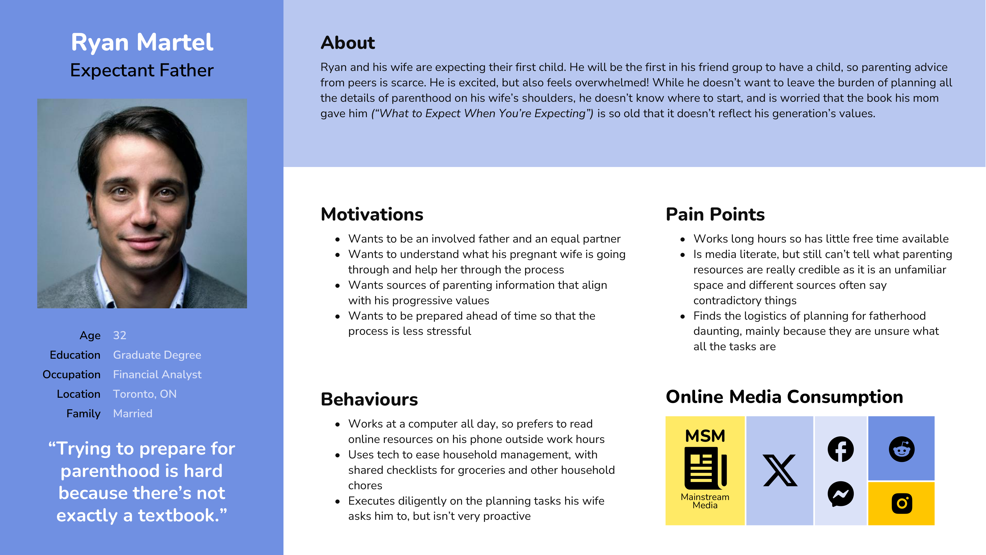
By creating a user persona I incorporated the key insights acquired through the user interviews to ensure that design solutions address real user problems rather than just an ambiguous generalized demographic.
The persona, Ryan Martel, highlights the key struggles faced by expectant Millennial fathers. Centering this persona also kept me mindful of the specific approaches, media habits, values, and heuristics that would be used by this audience when interacting with any potential digital solution.
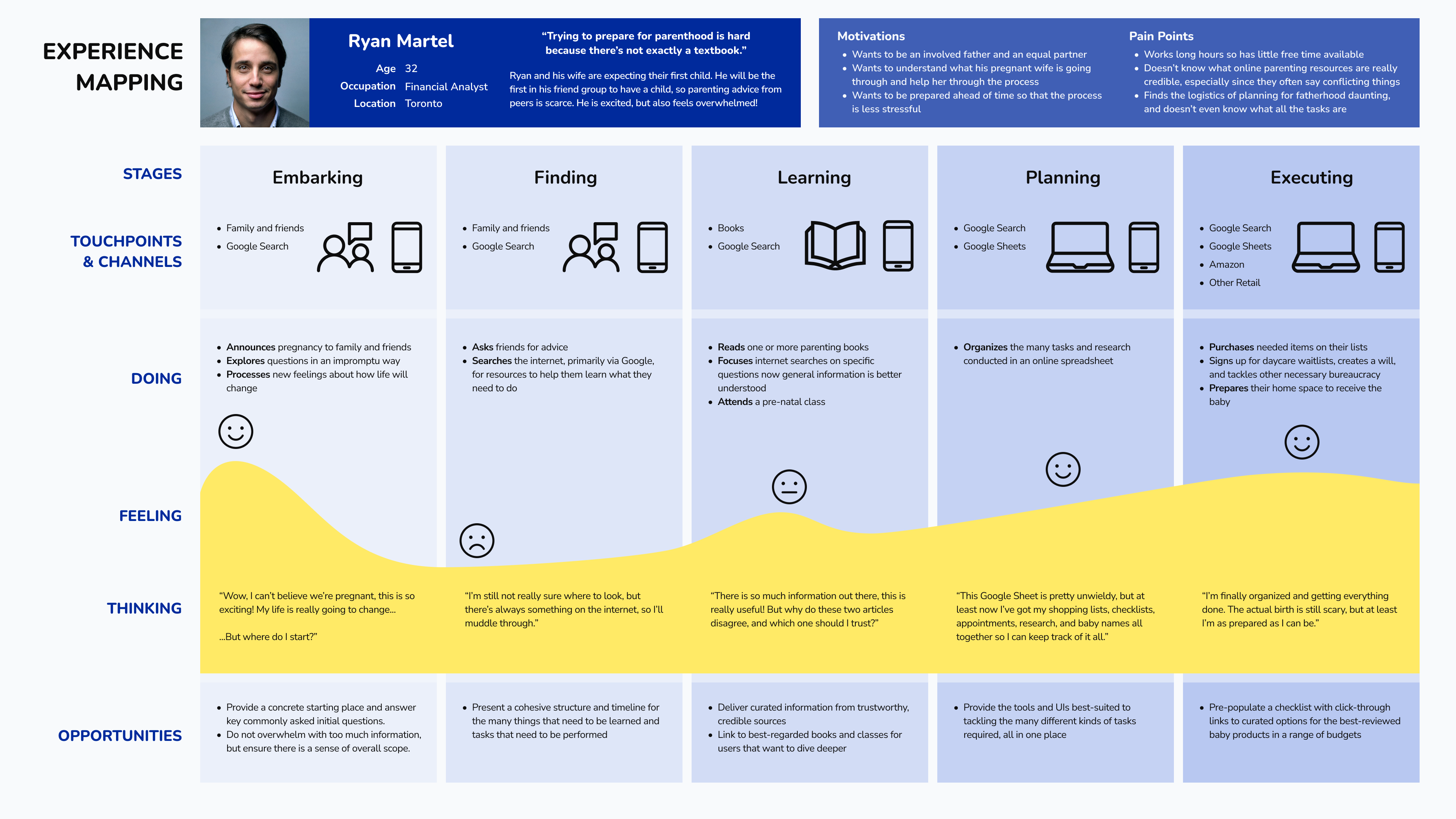
An Experience Map offered me a tangible way to understand the current user process and identify key areas where interventions for Ryan could be helpful.
User Stories
How would my persona address their pain points?
Using the pain points, motivations, and behaviours embodied in Ryan's persona, I created User Stories to understand how best to approach these challenges and goals in a digital app from their perspective.
I also developed additional User Stories for a different key stakeholder, the expectant mother. Understanding the mother's needs informed more user stories for the father role, especially relating to sharing functionality. A sample of the 40+ user stories I created for the app are shown below:
As an expectant father I want to have a pre-populated list of items I need to buy so that I know what I need to buy
As an expectant father I want to get curated recommendations for which items to buy so that I know which items are good
As an expectant father I want to get recommendations based on different budgets so that I can buy what I need based on my means
As an expectant father I want to have information and tasks provided to me in small chunks so that I am not overwhelmed by all the duties at once
As an expectant father I want to set a time to get notified about daily duties so that I can establish a routine
As an expectant father I want to see when each of the tasks need to be completed so that complete them according to their time priority
As an expectant mother I want to know what tasks my partner has completed so that I know our progress, and don't need to do them myself
Grouping these user stories into Epics helped me develop a proto-structure for the app's information architecture.
Epics
Shopping List (Core)
Education
Baby Naming
Task List
Account
Daily Duties (Secondary)
Social
I chose Shopping List as the Core Epic. Sorting, researching, managing, and purchasing baby items before the due date is a significant job, and represents a major cognitive burden for new parents.
I chose Daily Duties as a Secondary Epic. This will be a core functionality that will keep users like Ryan engaged with the app, making progress on their tasks, and organizing their time in a sensible way.
App Concept
“How can an app be the textbook for fatherhood?”
To achieve that, the app must...
-
Help the user understand and track all the tasks of fatherhood.
-
Ensure that information provided is reliable, with independently credible citations.
-
Facilitate organization and time-management to reduce stress in the process.
-
Align with modern parenting values and consider the needs of both parents in partnership.
-
Respect the tech-savvy nature of users like Ryan and give them some options for customization or flexibility to use the app as a “power user,” if so desired.
On average, there are about 250 days from discovering a pregnancy until the due date. With just 5 minutes a day of concerted effort, this represents nearly 21 hours of preparation work that can be accomplished in the time before a baby is born.
In that time, the app can...
-
Present contemporary data-driven research with proper citations on key educational areas to alleviate credibility concerns so that users can trust the sources.
-
Surface pre-populated lists for all the key required tasks and products, removing the “unknown unknowns” in the process that interviewees struggled with.
-
Motivate the user to establish a daily routine of chipping away at their tasks and assist them through each step to help manage the stress of organizing their time.
This feature constitutes one of the app's main Unique Selling Propositions (USPs) that differentiates it from other parent prep apps.
Finally, the business case...
An app needs to be financially viable to help its users. Out of one-time purchase, subscription fees, advertising, or affiliate revenue, the affiliate model is least disruptive to the user experience and also likely bears the most commercial viability for this app.
Parents can commonly spend $1000+ on baby preparation, so even a few percent of that total would represent a solid ARPU for a free downloadable app.
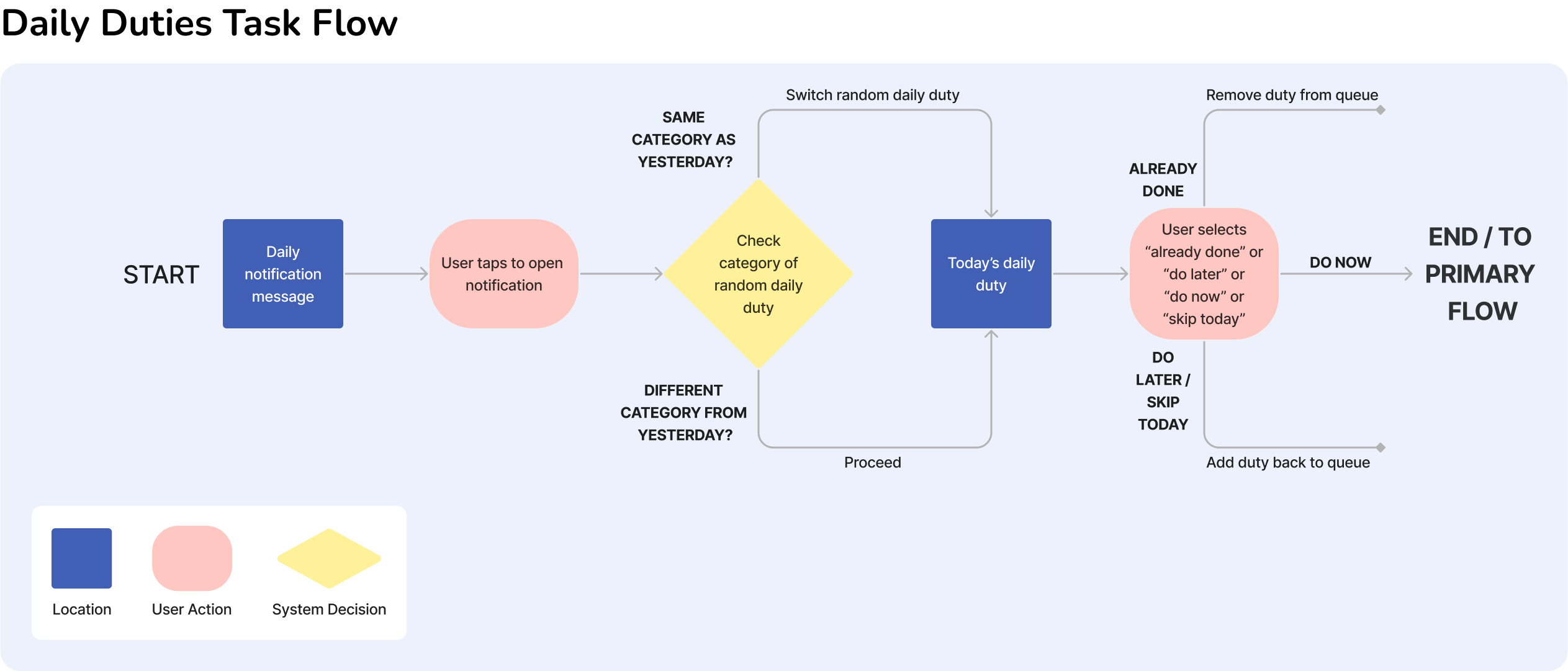
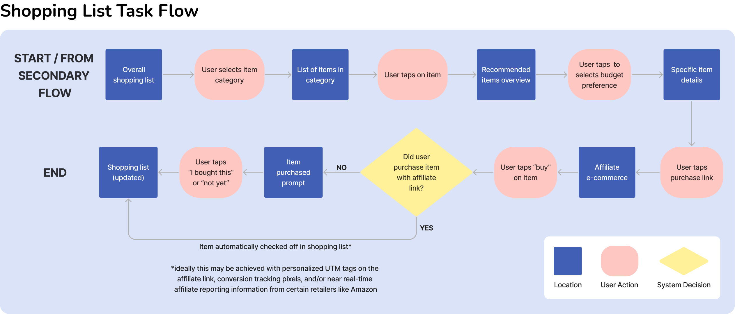
Task Flow
An MVP for the USP
The combination of a Daily Duties flow followed by another task, like Shopping, forms the core loop of the app’s functionality, allowing users like Ryan to create a routine and progressively achieve their goal of preparing for their child’s birth by making slow but steady progress every day on the long list of tasks.
By laying out a logical framework for the tasks and providing guidance and aids (such as curated recommendations) throughout the process, the app helps to alleviate the stress of preparing for fatherhood.
UI Sketches
An app starts to take shape
I mapped out key screens to demo the task flow:
-
Dashboard
-
Daily Duty
-
Shopping List
-
Product Detail Page
I based exploratory sketches on UI inspiration from existing mobile apps, and by experimenting visually with layouts, inputs, and controls to find what might function best.

Mid-Fidelity Prototype
Making the wireframes interactive
I converted the sketches into grayscale wireframes in Figma and then stitched them together into an interactive prototype. At this stage, layouts and fidelity of the user interactions - and ensuring that there could be user ambiguity in the flow - was my highest priority because I needed to know that the functionality would translate.
This transitioned into user testing....
...And then right back to the drawing board

In 2 rounds of user testing with 10 participants, overall results showed a favourable response to the concept and tone of the app, but highlighted some usability issues, some of which were critical.
The Daily Duty selection task had disastrous usability results, with just 1/5 of 1st round users successfully completing the task. There were four distinct actions that the user could take at this stage, and to avoid an overly cluttered UI I had implemented a “Tinder swipe” style interface, along with an explanatory graphic. Despite this, very few users understood the input mode.
My initial thought was that I wasn't explaining the process well enough to new users, so I created a V2 iteration with better onboarding, including:
-
Additional UX copy
-
Fully user-paced progression (tap to proceed on each step)
-
Animated visuals for each swiping gesture and a description of what action it produces for the user
Brand Development
Creating a distinctive app aesthetic
Despite these changes, 40% of users in the 2nd round of user testing still failed the task, an unacceptably high proportion for a core task flow. I needed to break down the problem in granular detail to evaluate where my original design assumptions had failed and find a new solution that better reflected my users' heuristic models.
While it is likely for Ryan to have used an online-dating app with a swipe interface like Tinder or Bumble, it became clear that many interaction heuristics exist within a relatively narrow framework. I needed to simplify.
This colour palette arose organically not just from the keywords, but from other symbolic and aesthetic reasons:
-
It is close to a split-complementary colour scheme, which is naturally harmonious.
-
Blue remains symbolically associated with maleness in North America.
-
Yellow can be associated with babies (e.g. the symbolism of Easter chicks), and this holds especially for modern Millennial parents who may not embrace the traditional pink / blue baby gender dichotomy.


Anatomy of a UI Problem
The Problems
The Solution


Other UI issues encountered were less critical, but still important to fix. When navigating to the Product Detail Page, several users pressed the checkbox on the Shopping List item instead of the item text, which would check the item off instead of bringing them to the PDP.
This was solved with an indicative chevron to show further menu depth, by increasing spacing between the checkbox and the item, and by adding a thin divider between them, both serving to change the semantic relationships between the different interactive components on the list item.


Logomark
For certain use cases (i.e. the app icon) where the full wordmark would be cumbersome, I created a logomark counterpart.
Using the idea of the father holding a baby with the baby representing a 5-minute slice of time was a simple, yet compelling, image that formed the basis for the final design.
Wordmark
After exploring various sketches, I distilled the app's USP into a design that prominently featured clock imagery.
To create more visual engagement, the final wordmark uses gradients inspired by the reflections on a classic domed sapphire blue watch face, a symbol evoking reliability and masculinity, and likely a familiar object for a man like Ryan.

After winnowing down a long list of potential options, I chose the name 5 Minute Dad because it:
-
Used "dad," which is the most culturally relevant word for father, per a Google Trends analysis.
-
Was both casual sounding and descriptive of the app's function and USP, unlike competing apps like "Who's Your Daddy" or "Baby Manager" that were only either one or the other.
To craft a brand and aesthetic that would be distinctive, aesthetically pleasing, and calming, I created a mood board. The traditional colour psychology of the brand keywords that would appeal to Ryan skewed heavily towards blues and yellows (with some orange).
It took me many iterations to successfully arrive at a UI colour injection that I felt reflected the approachable and confidence-inspiring aesthetic that would appeal to Ryan.
Soft tints and tones are calming (no one needs a stressful looking UI when dealing with a stressful situation), the sans serif typography is legible and professional, and the consistent use of bright white cards pop the important elements out of the UI.
Design Accessibility
All of the primary colour combinations used in the app meet WCAG AAA 7.5:1 contrast accessibility standards, with the exception of one (that still exceeds AA standards). Additionally:
-
The blue and yellow colour scheme reads well for colour blind people, with colours being reproduced faithfully from the designer’s perspective even for those with deuteranopia and protanopia
-
As the demographic is males, 1 in 12 of whom are colour blind, this was an important aspect of colour choice

Hi-Fidelity Design
Putting it all together


After learning my lessons in user testing, I made sure to use inputs and controls that were straightforward in form and function. While all the components were custom-designed, where appropriate heuristic models (e.g. the segmented buttons) were inspired by their implementation in Android's Material UI to ensure familiarity to users.
Since this flow follows a user through a Daily Duty, modals that guide the user through the process feature prominently.

Marketing Website
Appealing to Millennial dads
Design System
"God is in the detail" - Mies van der Rohe
As part of the process of building the app prototype, I created a complete style guide and UI library specifying in detail all of the components used in app prototype.
I explored tokenization in Figma to streamline the hand-off to software developers should that be desirable in the future.


To market 5 Minute Dad, I designed a responsive website prototype.
Aesthetically, Millennials like Ryan appreciate flat design styles more than older audiences, and the use of illustrations rather than photography makes the depictions of people more broadly relatable. The colour palette and rounded corners mirror the look & feel of the app itself, lending a calm and professional look to the site.
The UX writing throughout was also tailored to appeal to Ryan:
-
The tone balances casualness with respect for the reader's intelligence
-
Features and benefits are laid out in a straightforward way
-
The casual tone avoids feeling forced (e.g. no clichéd Millennial slang, or using words like "dude" as an interjection) while still eliciting a sense of male camaraderie
-
Fun wordplay is used where appropriate without veering into “dad joke” territory
Key Learnings
Wisdom from dad
Outcomes and Future
Considering what comes next
Every step in creating 5 Minute Dad yielded valuable insights, not just about the subject itself but about the process overall. Some key learnings I took from each phase:
In the research phase:
-
Larger interview sample sizes reveal more nuanced and potentially contradictory information, but increase the challenges of interview post-processing and synthesis.
-
That there are significant variations in the cognitive and emotional journeys different individuals even in the same demographic take during pregnancy.
-
Today's fragmentary media landscape lacks a single dominant cultural narrative, which can leave younger generations confused about the best way to navigate major life decisions
In the UI creation phase:
-
User testing is absolutely essential in the UX development process. No amount of conjecture can replace real world insights.
-
Even seemingly common or well-understood input models (e.g. “Tinderface”) may exist within a relatively narrow heuristic framework and deviations from that context can render them unsuitable for a UI.
-
When faced with usability issues, creating an explicit inventory of key decisions and challenging them to understand whether any assumptions made are still justified in the face of new data can help to break through conceptual stumbling blocks.
In the delivery phase:
-
Developing effective color palettes involves an element of taste and intuition as well as practice and experience. Cultivating these aesthetic skills is critical.
-
A moodboard can serve as a starting point, but adapting its elements for UI application requires flexibility, as well as acknowledging that it must be a living document.
-
Establish consistent grids, spacing, and design rules from the outset. This saves time when building a UI library and avoids the need for extensive rework of assets later.
Having completed the design process, I believe I have created a genuinely useful tool to benefit expectant fathers like Ryan.
By focusing on a specific demographic dealing with a discrete time-sensitive challenge, I could gather detailed research about their needs and create an effective, specific solution.
5 Minute Dad is not all things to all people, but it has the potential to make life easier and less stressful for expectant fathers by laying out a path with actionable goals and encouraging them to follow through.
The product plan for 5 Minute Dad has an expanded feature set and comprehensive task lists to further serve user needs. Collaborating with a developer to bring it to life as real digital product would be exciting.
Pragmatically, I could also "spin out" individual features into standalone websites. For instance, a pre-populated list of curated baby products (with associated affiliate links) that is responsive to a user-inputted total budget could serve a valuable user need with less intensive development effort while retaining commercial viability.
Another way to consider the future of the app is through its hypothetical impact using tools like the Tarot Cards of Tech.
The most significant risk lies in maintaining the app's credibility among users.
Building an app reliant on affiliate income demands a fine balance - users need to trust that recommendations stem from genuine interest in their wellbeing, not commercial motives
Emphasizing impartiality of the recommendations is critical to ensuring users see the app as a trustworthy tool, not a sales pitch.


With the solution sketches, the goal was to compile the elements and layouts that best balanced:
-
Fun or interesting user interactions with usability heuristics that would be familiar to Ryan
-
Good information density with clean, simple, and legible layouts
